Bridges of London and Budgerigars, a New Pique Assiette Mosaic

Bridges of London and Budgerigars Detail, Helen Bushell, summerhouseart.com

the inspiration
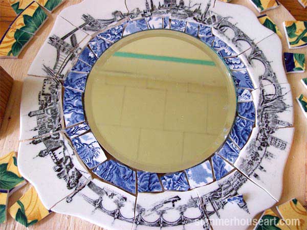
I’d had this fantastic plate with the bridges of London all around the rim for ages. I’d had a few ideas for it but nothing that really inspired me into action. Nevertheless, I’d broken up the pieces and kept them together with masking tape for years. They were waiting for me, dust covered and dirty, on my studio shelf. And no, I don’t dust my studio much, there are just too many dishes and ornaments and I’d never get anything else done. Priorities you know.

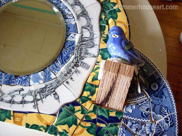
Bridges of London and Budgerigars Detail, Helen Bushell, summerhouseart.com

the ingredients
For some odd reason I’d always thought of the bridges with Budgies or Budgerigars as the Brits called them. For me they went to together. I just happened to also have a “loverly” set of salt and pepper shaker blue budgies. And I also just happened to have a plate covered in, what else, English Ivy.  Ah the joys of having lots of used plates and ornaments to recycle and transform into something fun.

And that “something fun” was a new mirror for over the sink, so I’d have something entertaining to look at while doing dishes. There are always so many dishes to wash aren’t there? And me, I’ve got a low boredom threshold.

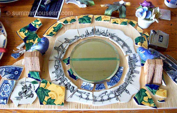
But what shape could this take? What would tie it all together? Finally, inspiration struck. An English Mantel clock! Or at least the shape of one….yes that would work. And with that, all the other questions were answered. I needed another plate for the “shoulders”, easy to find, waiting there all along in my studio stash. And the final touch? Well, what are the Brits famous for? Their gardens of course! So out came the porcelain flowers. You know, those little bouquets your mum collected.

Bridges of London and Budgerigars Beginning, Helen Bushell, summerhouseart.com

the finished piece
It took a while, but finally all the pieces were in place.  Well, almost, the budgie perches needed mosaic and the grouting needed doing.

Bridges of London and Budgerigars Detail, Helen Bushell, summerhouseart.com

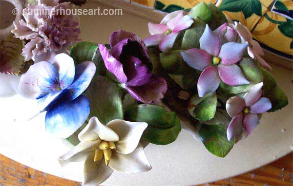
The only thing left to do was glue on the budgies and the flowers. With a bit of careful chiseling I freed some flowers and leaves from their little porcelain pots and glued them into place.

Bridges of London and Budgerigars Detail, Helen Bushell, summerhouseart.com

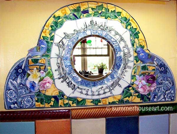
Now, I’ve got the Bridges and Budgerigars of London over my sink, surrounding a mirror that reflects the stained glass window we bought years ago, also from England. And I must say, I rather like it.

Bridges of London and Budgerigars,  Helen Bushell, summerhouseart.com

Share

A Study in Contrast or How I Created Two Very Different Mosaics from the Same Shards

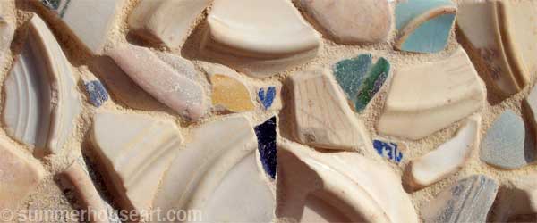
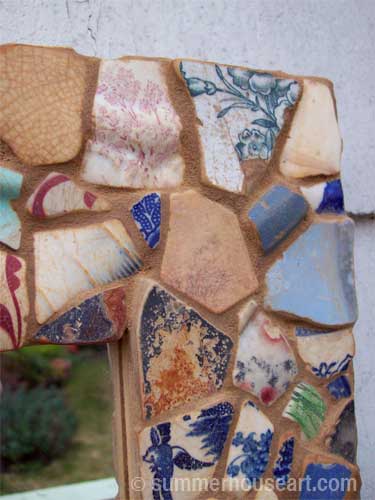
detail, Pale Beach Pottery mirror by Helen Bushell, summerhouseart.com

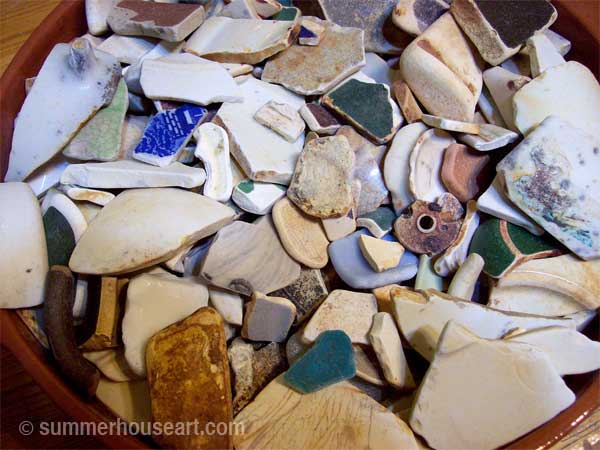
A month ago, picking through all my bits of ocean tumbled pottery, I’d started a new pique assiette mosaic mirror. You would think that picking bits from the exact same basin of shards, I would come up with almost the exact same mirror frame that I’d created back in January. That was when I’d first started experimenting with these smooth, aged and beach sanded shards.

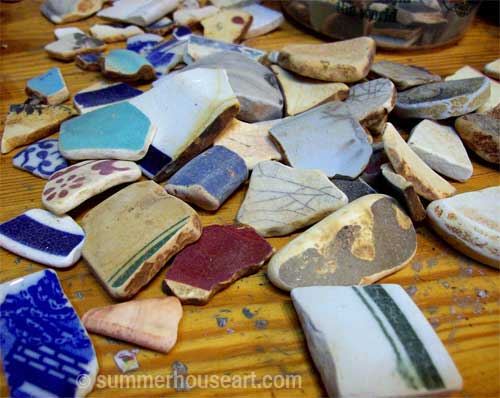
Beach Pottery shards, summerhouseart.com

And maybe, I might have. But as I was arranging shards, I found myself attracted to the lighter pieces, the undersides of plates, the curves and how they created a pattern and a movement.

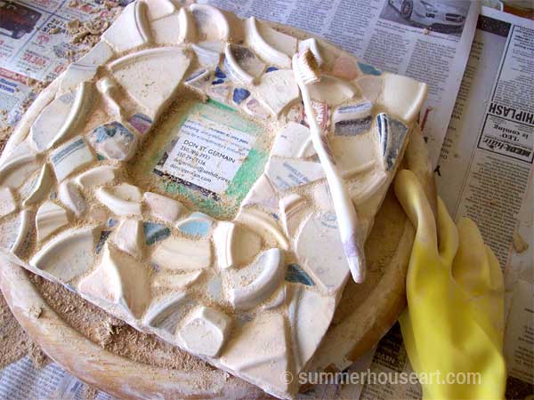
Stealing time here and there from other things, I finally got to the stage of grouting last Friday. And accompanied by the soundtrack to “Monsoon Wedding” CD, ( another lucky garage sale find), mixed up a a couple of different grouts until I got a shade to my liking and grouted it up. BTW, if you have never seen Monsoon Wedding I’d highly recommend it. The movie is colorful, lively and has great music…..but at the end, for all of us mosaic lovers, there is a wedding scene in a mosaic covered grotto. I just kept playing that scene over and over trying to take in the mosaics. And yes that is an old toothbrush, that I’m using to clean off grout. And you thought there wasn’t another use for them.

grouting, Pale Beach Pottery mirror by Helen Bushell, summerhouseart.com

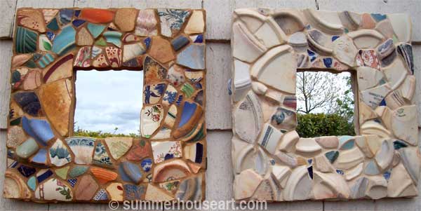
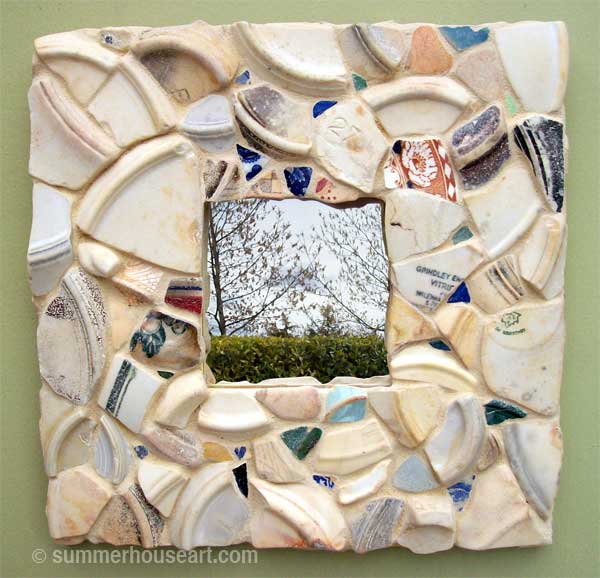
I was struck by the contrasting frames that I’d created with almost the same ingredients. All the result of my choices from the pool of shards. I couldn’t resist hanging them side by side to enjoy the contrast. The first mirror is a collage of all of the rusty and patterned pieces. The second mirror frame is a quiet, almost monochromatic arrangement, with the movement created by the curves as the central theme.

 Pattern and Pale Beach Pottery mirrors by Helen Bushell, summerhouseart.com

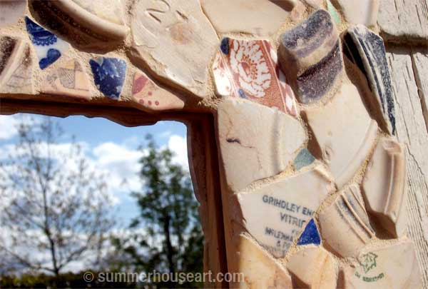
Of course, I did add a few little detailed pieces to break up the surface and add interest. In the header of this post, if you look carefully, you will find the tiniest little blue heart. In this corner you will find the few special bits I loved and a found space for, like the floral shard of some long ago shattered tea cup or a remnant of the  manufacturers mark on the bottom of the dish.

detail, Pale Beach Pottery mirror by Helen Bushell, summerhouseart.com

And here it is, up close and personal, on a more pleasing background to highlight it’s quiet colors. I’m quite happy with it. It’s a bit of a departure for me too, the artist who likes bright and gaudy, don’t you think?

Pale Beach Pottery mirror by Helen Bushell, summerhouseart.com

Share

A New Pique Assiette Mirror or The Beach Pottery Shard Experiment

Beach Pottery shards, Summerhouseart.com
My latest student has a dream of creating a mirror with four special tiles and a huge collection of beach pottery shards that she has been collecting for years. When I saw the tiles and her collection of beach pottery I knew instantly that the shards and tiles were meant to be together. But it left me with a problem to solve. I have always avoided using beach pottery shards for mosaic because I was afraid of how grout would react with them. A year ago, I’d seen another mosaic artist use it on a vase and she had reported no problems with it. But I knew I had to try it out for myself. It was time for me to experiment on a small mirror.

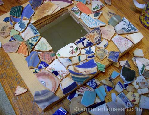
Laying out Beach Pottery shards, Summerhouseart.com

Luckily I had been given someone’s entire collection of beach glass and pottery shards over a year ago and added it to my own collection. All those lovely worn, wave-washed pottery shards had been waiting in the greenhouse for this day.

Beach pottery shards feel smooth under your fingertips, their surfaces ground by waves and rocks. Unlike the shiny, grout-repelling porcelain surface you have on new dishes you now have a matte surface, worn and pitted. I wondered if the grout grittiness would ruin the surface and if the colorant in the grout would mar and color the surfaces and sink into the pits. I also wondered if I’d like the matte surface against the grout when I was so used to the jewel-like mixture of dull grout setting off shiny bits and pieces. Well, the only thing to do was try it.

Laying out Beach Pottery shards, Summerhouseart.com

Deciding on a random design, I started applying the pieces as they fit. I wanted to avoid having to cut the shards and preserve the smooth edges that they already had.

Laying out Beach Pottery shards, Summerhouseart.com

After spending a few hours listening to music and getting lost in the meditative world of fitting shards I was soon near the end and pretty happy with the result. I’d taken quite a few breaks, something I always recommend to my students, to stretch and move. It’s so easy to get caught up and give your self a nasty back spasm from being in the same position for too long lost in your work.

Mirror with Beach Pottery shards, Summerhouseart.com

I left it all overnight to allow the mastic to set and harden. Tomorrow would be the test. I must admit to some trepidation. I loved the surfaces on some of the shards so much that I was loath to lose them if the experiment failed.

Mirror with Beach Pottery shards, Summerhouseart.com

Next day, I mixed up the grout. After a little consideration, I’d chosen a colored grout that coincidentally evoked sandy beaches called Summer Tan. I needed to find out if the grout colorant would be a problem. And if it was a problem, at least this color, which was a bit rusty would at least blend in with the rustiness of some of the shards if it did sink into the pits on the surface.

Mirror with Beach Pottery shards, Summerhouseart.com

And the final result? Well, I must admit, it was a little harder to clean off the grout. The matte surfaces held onto the grout and developed a cement sheen that had to be rubbed off and even sponged. I hardly ever use a sponge, preferring instead to only clean with old cotton socks. Oh yes, there is a use for all those old cotton socks with big holes in the heels!

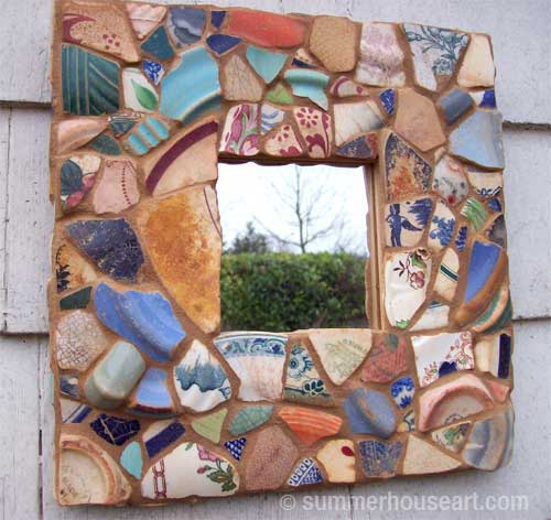
I loved the final look! This surface felt old and worn still and so smooth to the touch. It all looked antique and I wished in the end that I’d used an old worn mirror too. Ah well. Experiment done. I was glad though that I’d used the rusty colored grout, because where it did stay in the pits on the surface it looked natural.

Mirror with Beach Pottery shards, by Helen Bushell, Summerhouseart.com

Conclusion: yes it’ll look good and yes it will be a bit more work.. but all very well worth it. And next week we’ll use these results to help my student create her dream.

Share

#7 in the Pique Assiette Mosaic Inspiration Series – A Little Bird and an Abundance of Fruit

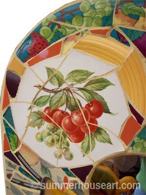
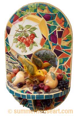
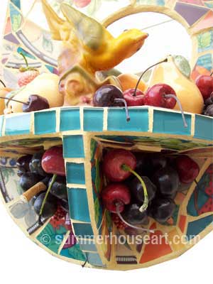
With this Pique Assiette mosaic shrine, the fruity patterns on the dishes created the main theme. As sometimes happens there was one dish that started the ball rolling. In this case it was the little plate with cherries.

Bird and Fruits mosaic, Helen Bushell, summerhouseart.com

Without a clear idea in mind, I started to set aside dishes I found with fruit patterns on them. I didn’t know where it was going, had no clue really, just a feeling that someday I’d do something with a fruit theme. Besides, all these fruity dishes were really quite beautiful. For months no real idea came to me as to what I’d do with them.

Then one day, probably while out shopping for dishes to break, with some of my students, I happened upon this wonderful little bird. I don’t know who designed this bird, who lovingly sculpted the original, but thank you, mystery artist. Ok, looking at it, it’s probably a collectible ornament, maybe even worth money, but to me it was the missing piece. It was the piece that twigged an idea. Fruit and birds, birds and fruit. We have grapes and kiwi in our garden as well as a small apple tree. Birds love these fruits. They like to take a tiny bite and move on to the next fruit.

Bird and Fruits mosaic, Helen Bushell, summerhouseart.com

I saw the bird on a shelf and immediately knew the bird should be reflected in a mirror. Then I needed fruit. Where to get some? Well, thrift stores are full of fake fruit, nice squishy fake grapes and cherries, pear salt and pepper shakers, apple and orange ornaments. It didn’t take long at all to collect what I needed.

I often tell my students that making art is all about making one decision after another, often using intuition. In this case, once I had the final ingredients, all the decisions seemed to make themselves. For one, I made everything rounded, the shelf, the shape of the support, it all seemed to call for roundness, fullness, dare I say rounded fruitiness.

I could have done the mosaic pieces as a random overall pattern but chose instead to group the patterns in flowing areas to set off the cherry plate. The piece was almost too easy to do. I let intuition guide my decisions and with the find of the bird ornament, the piece just “flew” together. OK, OK, I’ll stop now.

detail, Bird and Fruits mosaic, Helen Bushell, summerhouseart.com

Then last, but not least, I wanted it feel abundant, like the way that trees and vines full of fruit make us feel. Under the shelf, I glued veritable bunches of those nice squishy, kitschy grapes and a few cherries, so it was practically dripping abundance. I’ve given the pretty bird a setting, a home. I like it, it makes me smile. That’s all I really need.

Share

#6 in the Pique Assiette Mosaic Inspiration Series – Using Intuitive Design on Pots or How Not to Be a Control Freak

Mosaic Inspiration #4 I talked about the intuitive process to create an overall random design on a flat surface like a mirror. And if you’ve looked at our stepping stones you’ll see that I use this method there as well. I admit, I like working this way, it’s meditative and challenging at the same time and never boring. And there are benefits!

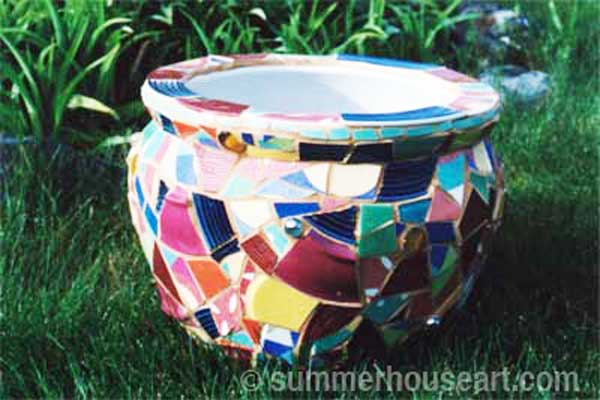
 Mosaic Pot by Helen Bushell, summerhouseart.com

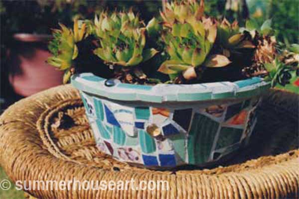
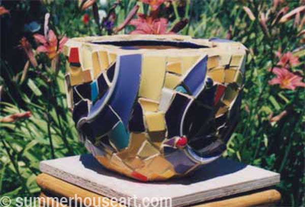
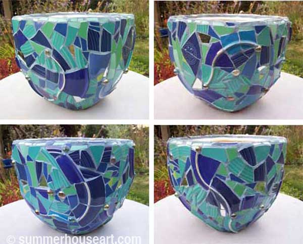
Now, I have to say that working like this is especially fun on 3D surfaces like pots. I’ve done quite a few pots in this manner. In each case, I selected dishes that had colors, patterns and textures that I liked together. To those, I added some solid colors and a few marbles. Marbles have a way of glowing when the light shines through, that I find totally captivating.

Pique assiette Mosaic Pot by Helen Bushell, summerhouseart.com

I tell my students that doing intuitive mosaic design has one really great benefit, especially if you tend to be a control freak. You will learn to let go. Working intuitively allows you to forget control and just go with the flow. After all you are not creating a picture, or a rigid pattern. Nope, just an overall pattern with a mixture of surface designs. Ah, the freedom to just let go and mix it up.

Going with the flow also applies to fitting dishes onto a curved surface. A dish does not have the same curvature as a pot. To make up for this you often have to adjust how you apply a piece to the curve of the pot. Oh sure, you can keep breaking the piece till it’s small enough to apply to the curve ( um, this could be called exerting control) or…you can just find the curve of the dish and find a place where it will match the curve of the pot. Ah, even less control.


Pique assiette Mosaic Pot by Helen Bushell, summerhouseart.com


Pique assiette Mosaic Pot by Helen Bushell, summerhouseart.com

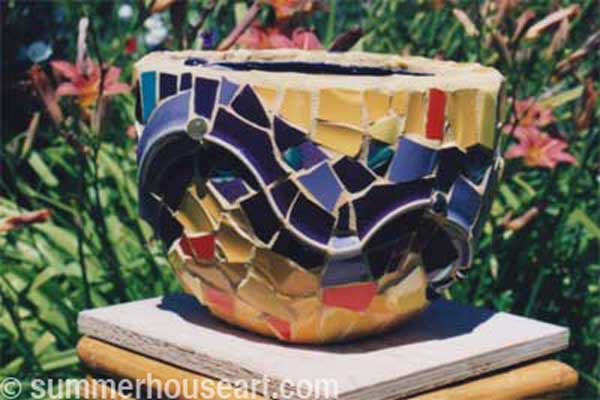
Using dishes that have color on the bottom as well, creates an extra little benefit. The ridge on the under side of the plate, once broken, can be pieced back together to create some very nice undulating lines, thank you. I’ve used this often to create a flow or direction. It’s a little trick that I totally took advantage of on some of these pots.

Pique assiette Mosaic Pot by Helen Bushell, summerhouseart.com

The last little benefit about applying pique assiette mosaic to pots is that unlike a flat surface like a tray or mirror frame, you can’t see the whole surface at once. You may ask, how is this a benefit? Well, if you get tired of one side you just turn the pot around and viola, you have a whole new surface to feast your eyes on.

Share

How to Paint a Rug on a Deck Floor or at Least How I Did It…

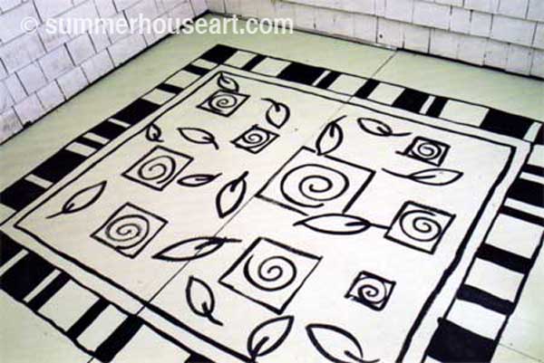
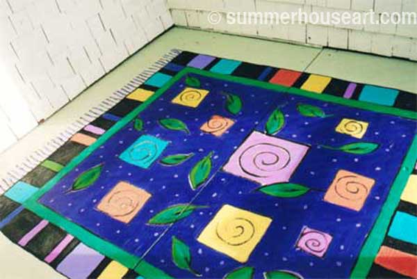
I’d painted a rug on our deck when we first moved in. But one day, due to some rotting of old plywood part of the deck had to be replaced. Now the deck been repaired and repainted and it looked wrong. Just a flat color and there was nothing to hold the area together visually. Obviously, we needed to paint on a new rug!  So today I’m going to have a post all about how to paint a rug on a deck floor, or at least how I painted one…

The deck was already clear of furniture and plants so we had a clean slate. What colors? Well that was easy.  As color inspiration, I just chose all my favourite colors at the time. The beauty of that is that they always go together. Everyone gravitates to certain colors naturally, and we tend to buy our clothes and accessorize our lives in these colors. Don’t fight it, just go with the flow and you will find you have a pallet of colors without having to think too hard. My colors have changed a bit since then and if I’d done the rug today I might have chosen deep purple, lime green, turquoise, majenta and touches of red and orange. Hmm, maybe I should change those colors. Oh don’t tempt me!

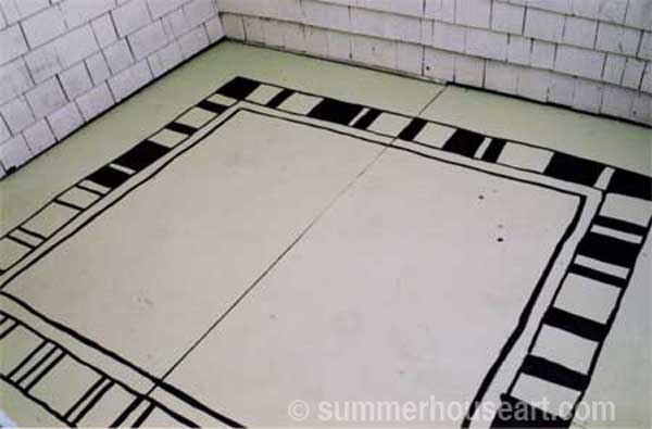
A very simple design was quickly sketched out on paper and off we went.   I drew out the design in pencil and then outlined it all in black paint. By the way, the whole rug is done in acrylic paint, just the paint we get from the art supply store, which we, as painters, had on hand. It dries very quickly (about 20 minutes on a sunny day) and we took lots of  tea breaks between colors. Artist acrylic paint stands up very well to sun and weather and in fact this rug has been on the deck for more than 5 or 6 years and it’s stood up better than the deck paint from the paint store!

How to paint a rug on Deck floor tutorial, Helen Bushell, summerhouseart.com

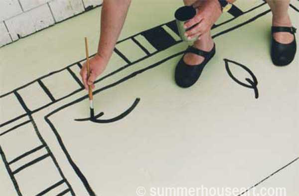
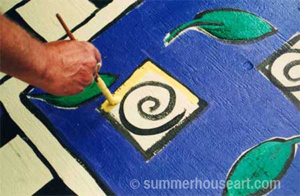
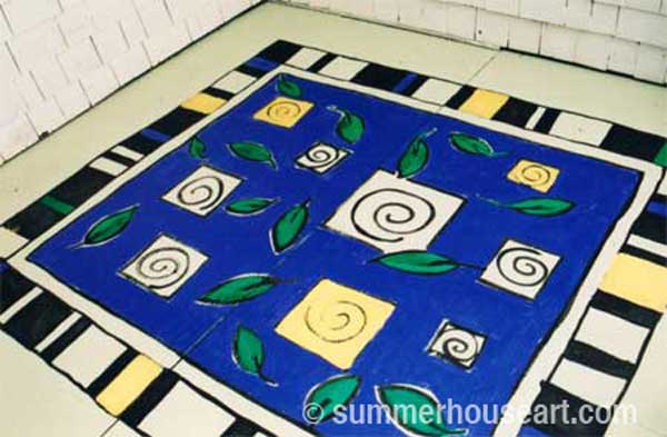
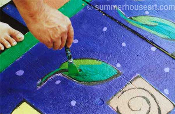
The black outline was done freehand in paint because I wanted a loose and energized feel to it. First the border was done and then I added leaves in a very simple design and squares that punctuated the overall space in a free handed way. Each square held my fave motif, the spiral.

How to paint a rug on Deck floor tutorial, Helen Bushell, summerhouseart.com

Just go with some design element you like. Maybe it’s paisley or maybe flowers, whatever. Just take that element and toss it all over the surface. I kept it very loose and didn’t worry too much about being symmetrical. I don’t  really like things that are too balanced.

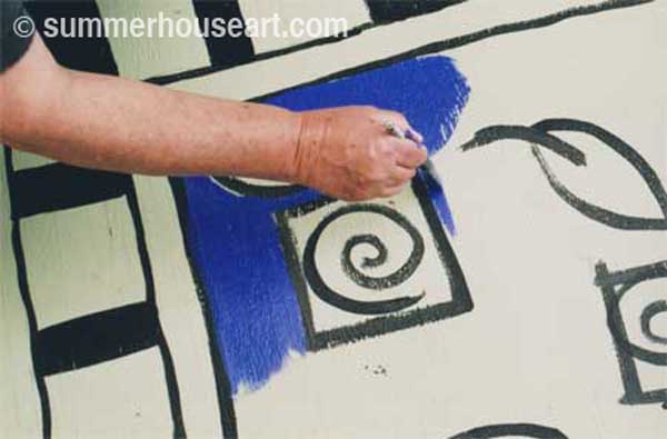
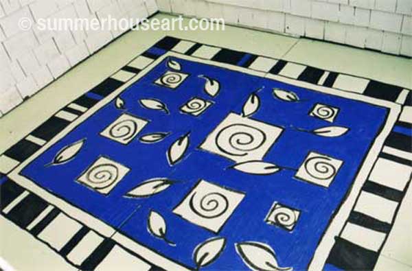
How to paint a rug on Deck floor tutorial, Helen Bushell, summerhouseart.comFrom there I started with the central color, a deep purple-blue, leaving the leaves and squares free of color to be applied later.

How to paint a rug on Deck floor tutorial, Helen Bushell, summerhouseart.com

How to paint a rug on Deck floor tutorial, Helen Bushell, summerhouseart.com

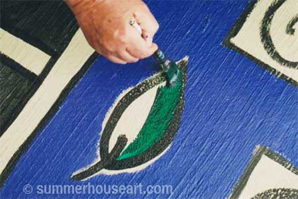
Then the leaves were filled with one shade of green. I would later add a touch of another shade of green to give them more depth.

How to paint a rug on Deck floor tutorial, Helen Bushell, summerhouseart.com

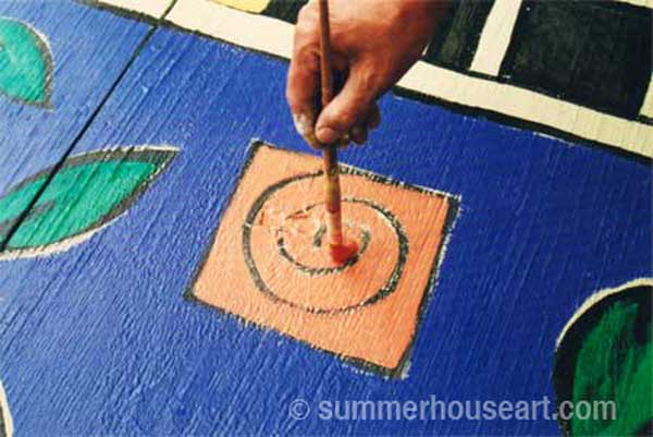
Then each spiral color was mixed and I filled in the squares around the black spiral without worrying too much about being even.

How to paint a rug on Deck floor tutorial, Helen Bushell, summerhouseart.com

How to paint a rug on Deck floor tutorial, Helen Bushell, summerhouseart.com

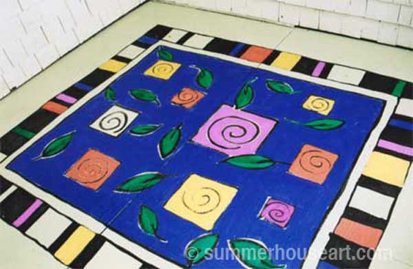
Whatever was left of that color was added to the spaces in the border.

How to paint a rug on Deck floor tutorial, Helen Bushell, summerhouseart.com

How to paint a rug on Deck floor tutorial, Helen Bushell, summerhouseart.com

I added a light green to the dark green leaves to give them a bit of a pop.

How to paint a rug on Deck floor tutorial, Helen Bushell, summerhouseart.comThen it almost seemed done. But the blue needed something to keep it from visually sinking, something to bring the design right up at the surface. Ah, dots! Little mauve dots were randomly added to the surface. This made the whole area become more animated.

Still something missing? I’d almost forgotten. A rug needs tassels. The tassels were first painted on in black and then a thin line of mauve was added to give them a rounded look.

How to paint a rug on Deck floor tutorial, Helen Bushell, summerhouseart.comTah dah! The whole rug was a hit. After leaving it overnight to allow the paint to cure, all the plants were moved back as well as the chairs and table. We’ve enjoyed it for years now.

How to paint a rug on Deck floor tutorial, Helen Bushell, summerhouseart.com

Every spring, even though this is a covered deck, after all the winter storms, it’s covered with dirt and leaves. I just wash it off, sometimes even using a scrub brush, and hose it down. It’s become very nicely worn looking. And if I want, I may even one day change the colors just for fun. So as you can see, pretty easy and fun. And I don’t have to worry about corners of the rug rolling up and tripping myself!

Please feel free to leave comments or questions. I’d love to hear from you.

Share

#5 In the Pique Assiette Mosaic Inspiration Series – Feng Shui and the Foo Dog


I like to dabble in all sorts of things, like to shake up my thinking a bit. Feng Shui was one of those interests that I took up for a time and I even incorporated some of its ideas into my home here and there. For instance the far corner of the greenhouse, the “wealth corner”, is full of Jade plants, or money plants. There are other little touches throughout the house too. And I admit that keeping the Chi flowing is a good reason to tidy up. But for an old hippie like me, there are just too many rules to Feng Shui, so I just picked up a few that I liked.

Feng Shui Mosaic, Helen Bushell, summerhouseart.com

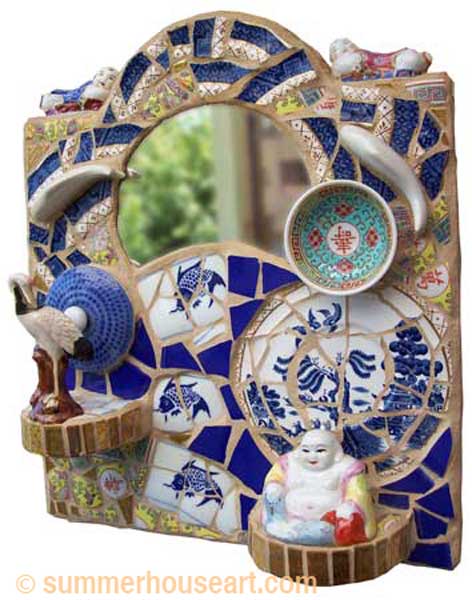
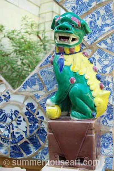
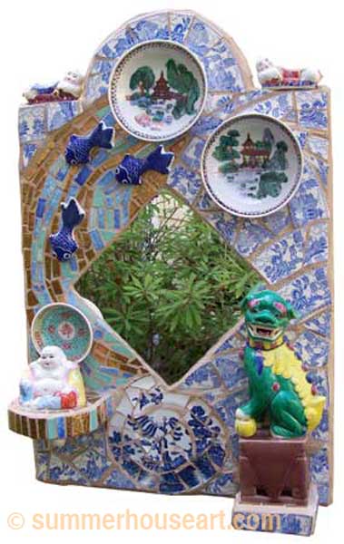
When I found the Foo Dog or Lion at a flea market, I knew I just had to do another Oriental Shrine pique assiette mosaic and I wanted to incorporate a bit of Feng Shui too. I’d already done a small shrine incorporating a couple of Blue Willow porcelain saucers, some chopstick rests, a little Buddha and a stork figurine.  Pique Assiette mosaics, by the way, are a type of mosaic quite different from the usual mosaic made with tesserae, because of the use of the dishes and ornaments.

I’d been trying to cut a round mirror when it just cracked on its own in this wonderful semi-moon shape. Well, something like that cannot be wasted! The shape of that mirror dictated the shape of the shrine and created the shoulders to put the little chopstick rests on. Everything just flowed together.

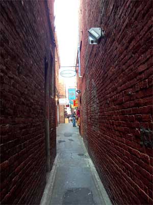
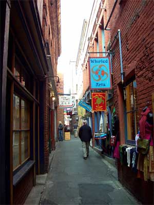
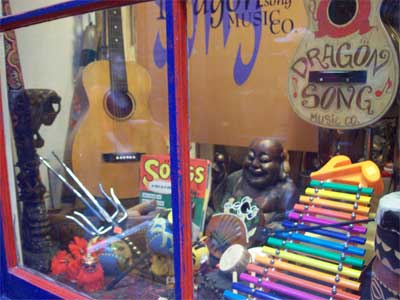
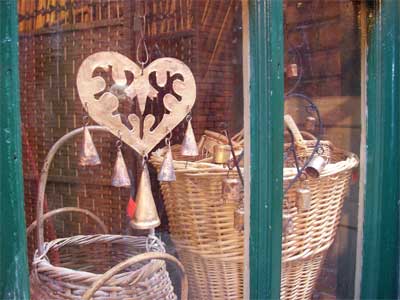
Where did I get almost all of these wonderful ingredients for the shrine? Well, here in Victoria, we have the most wonderful Chinatown ever. I love shopping in Chinatown, especially in a hidden little alley called Fan Tan Alley which is just too much fun to prowl.

Fan Tan Alley entrance from Pandora Street, Victoria BC, photo summerhouseart.com
The mystery entrance to Fan Tan Alley from Pandora Street

Fan Tan Alley,  Victoria BC, photo summerhouseart.com
Character shops in the alley

Fan Tan Alley,  Victoria BC, photo summerhouseart.com
The window of Dragon Song Music

Fan Tan Alley,  Victoria BC, photo summerhouseart.com
Baskets in a Fan Tan shop window

Now, with the find of the Foo dog, again things that I needed just seemed to fall into my lap. The background was made from some really good, antique Blue Willow dishes, given to me by an antique dealer friend of Eric’s. They were chipped and perfect for breaking. And break they did, like butter! So easy to cut and shape.


detail, Foo Dog Mosaic, by Helen Bushell, summerhouseart.com

More chopstick rests and another little Buddha were found on a trip to Chinatown. Any excuse to go there will do, after all. Other oriental saucers were found in Value Village and before I knew it, the piece was ready to start.

Foo Dog Mosaic, by Helen Bushell, summerhouseart.com

But this time I wanted to incorporate some Chi into the design. Chi is a flow of energy in Feng Shui . For that I wanted a water flow, so I created a little “golden river” for the fish to swim in, that led to the serene Buddha. The Foo Dog or Lion was at the gate to protect the Buddha and would keep the “Blue Willow garden” tranquil.

And so Feng Shui, with a nod to tranquility, Chi, and the garden became a design element in this little shrine.

Share

#4 in the Pique Assiette Mosaic Inspiration Series – Intuitive Composition

Making a Pique Assiette mosaic can actually be a meditative pursuit.  Pique Assiette Mosaics are a type of mosaic made with dishes and found objects.  Part of the fun with this is wandering  through my huge collection of dishes to find pattern and colors that work together. The time spent cutting pieces of dishes or tiles, the slow work in arrangement of those pieces is a quiet and focused time.

Past inspiration entries have been about an idea that started a piece, as in the Hawaii shrine or a certain dish that inspired a shrine as in the Geisha Ladies Japanese Shrine. The composition was planned, the drawing made, the goal in mind, more or less. Now I’d like to show a much more abstract way of approaching mosaic. Strangely enough it is the easiest to do, the hardest thing to explain and also the hardest to teach. A photo or two might explain it better.

All artwork has a composition. Good composition has a balance to it. Not that everything should be symmetrical, but that colors and pattern are visually weighted  to make the piece have  balance, as in not top-heavy, or with too much happening on one side, without the balance of a larger area opposite to give an equal weight. I think it’s something we all do intuitively.

Sometimes I just want to create a surface, a surface that has no real narrative to it, in that the surface is not a picture of anything. It doesn’t tell a story, the pieces don’t make up a recognizable object like a bird or tree. It’s just a surface. I like to think of it as abstract.

Sometimes I feel like doing a nice relaxing mosaic. I just want to play with color, texture and pattern and let the mosaic happen.
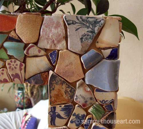
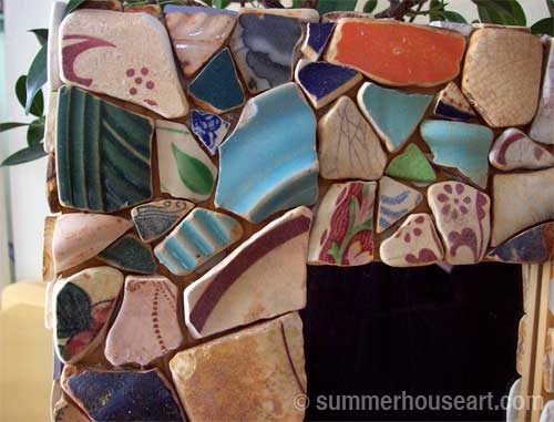
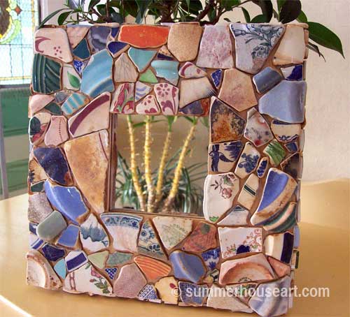
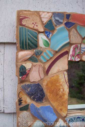
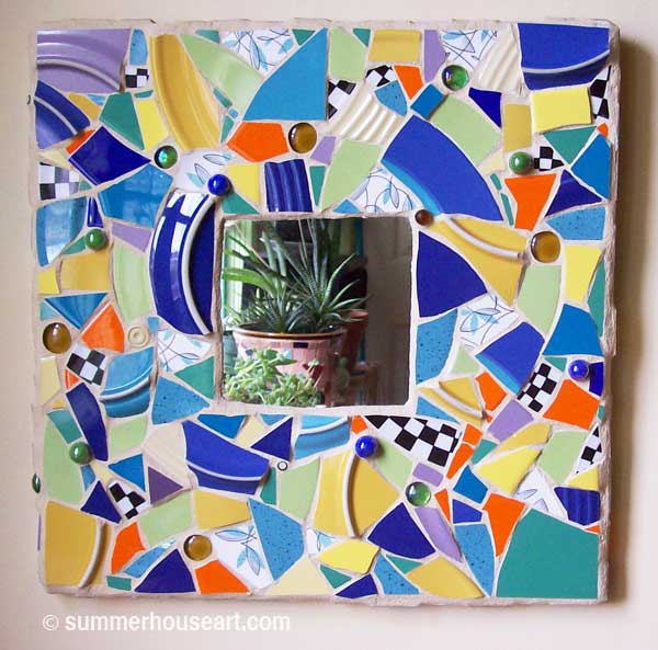
The two mirror frames I’m showing today were done just for the fun of creating an abstract surface.
Pique Assiette mirror, by Helen Bushell, summerhouseart.com

To start I choose the basic shape. These were square, because I just happen to like the square format. The mirror is set just a little deeper at the bottom, to give a visual lift to it. But I have sometimes thought it would be interesting to have each side equal because then there would be no up or down designated and the mirror could be turned to enjoy a new view of the design.
detail, Pique Assiette mirror, by Helen Bushell, summerhouseart.com

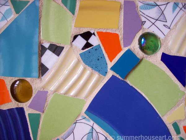
Next, I chose the colors and other elements. Maybe I’ll have only one plate with a pattern on it that I love. So I choose that and then choose other colors and textures to compliment it or set it off, riffling through my collection of dishes for just the right ones. The first mirror frame above, has a plate from the 50’s on it, a delicate turquoise and black pattern of leaves and lines shown in the photo above. I only had one of these plates so could only use it sparingly. The broken pieces of that one plate are placed throughout the design, a little bit here and there, spread out over the surface.
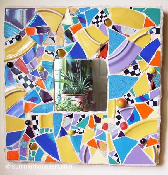
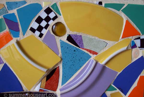
Pique Assiette mirror, by Helen Bushell, summerhouseart.com

detail, Pique Assiette mirror, by Helen Bushell, summerhouseart.com

And all the other space? Well, that’s were intuitive composition comes in. That’s where letting the mosaic flow on it’s own comes in. I just start. Putting down a piece in the corner, whatever fits, and keep going from there. If a piece fits naturally next to that, in another color, it goes next to it. The curves above give a sense of movement.

It’s like fitting a puzzle together. Your eye scans the broken pieces for fit, for a color, a texture and if it fits, in it goes, glued down and on to the next one. You step back now and then and sense, rather than see the balance in the composition. You know intuitively that you need a bolder color over in this area to balance the pattern across from it. It’s hard to explain, but much easier to do if you let your instinctive color response go to work.
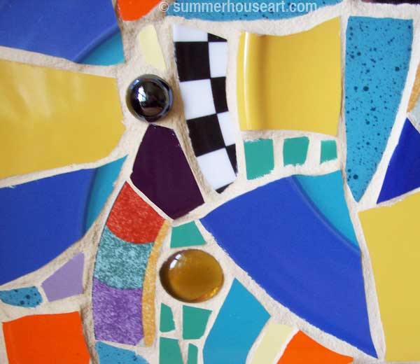
detail, Pique Assiette mirror, by Helen Bushell, summerhouseart.com

And yes there are a few “rules” to make the composition more interesting for the “eye”, such as varying the size of the pieces, as in the close up shown above.

The mosaic, with the help of my mediative, intuitive senses and vision, just creates itself. And at the end, what do I have? If I trust myself, and let things happen, very often a piece with movement, that encourages my eyes to roam the surface directed by a curve of color which leads it to another color or texture that leads it to another area and somehow you end up with a surface that your eye loves to skate over,over and over. Eye-candy I like to call it.

Why is it so hard to teach? Most people are not used to just letting go and allowing intuition to take over. That’s the crux of it I think. But once you do and let it happen the focus on arranging and searching for the next piece is meditative and quite relaxing. And once you’ve done it once, maybe just a little bit addictive.
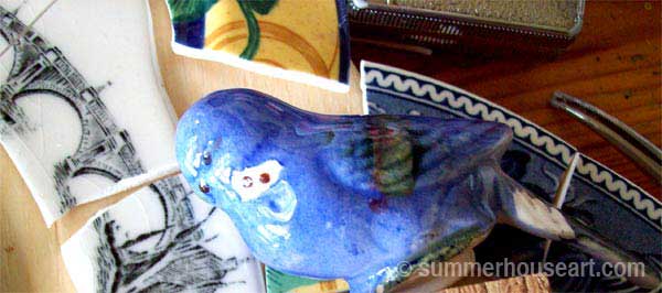
Share

#1 in the Pique Assiette Mosaic Inspiration Series – Hawaii

Next week I’ll be starting mosaic classes for a few new students and I know that one of the questions everyone usually has is how to come up with an idea for a piece. So I’ve decided to do a series of blogs on inspiration.

Well, getting inspiration is really not all that hard. Sometimes you just let it all happen. Often, my problem isn’t getting an idea but choosing which idea to work on. I usually have too many ideas. I’m a Pisces and apparently making decisions is tough for those of us in this area of the horoscope. Or, as Jimmy Buffet says  ” Indecision may or may not be my problem”.

It may be easier to show how inspiration works than explain it. So, as I said in the beginning of this blog, I intend to do a series and will show a few of our mosaic pieces and how they came to be. And hopefully that will say a bit about inspiration.

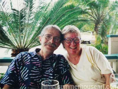
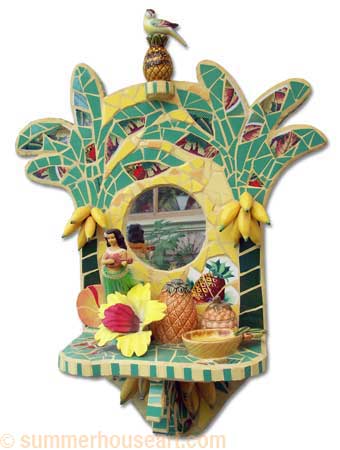
#1 in the series is my favourite mosaic,” Aloha”, one of the first mirrored and shelved mosaics I did. What was the inspiration? Well, obviously, Hawaii. We had enjoyed every moment of a vacation in Hawaii. We’d immersed ourselves in every touristy thing and soaked it up. We wore Hawaiian shirts and shorts and carried our camera around our necks.

Will and Helen in Hawaii, summerhouseart.com

I fell in love with the Hula dance and the music and Will and I both fell in love with Hawaiian shirts. And then of course there were the palm trees and all the tropical flowers, like orchids. Well, nirvana. And did I mention that the first morning on Oahu we went, wait for it…yup, garage sailing. And some of the pieces that went into this pique assiette mosaic came from those Hawaiian garage sales.  Pique Assiette, by the way refers to a type of mosaic done with broken dishes and found objects, which is right up my alley.

Once we got home, I had the idea to make a piece to commemorate our trip, and things just started to happen. Things for the mosaic started to appear on trips to thrift shops.

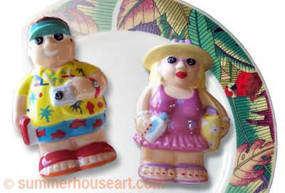
saltpepperwm

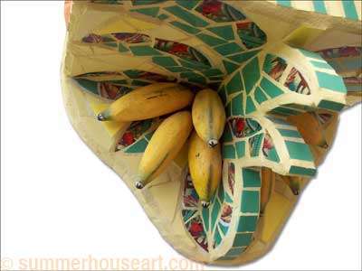
The dishes with the palm trees and parrots, the Hawaiian dashboard dancer ( I LOVE kitsch) , the bananas and the plates and salt and pepper shakers. All of them just appeared in my site lines as if by magic.

Aloha Shrine by Helen Bushell, summerhouseart.com

At some point I got the idea to have a shelf to hold all of the Hawaiian goodies. And then I had to create something to put under the shelf. This gave the extra benefit, we realized later, that when you were sitting down you had a whole other dimension to enjoy in the mosaic.

detail, Aloha Shrine by Helen Bushell, summerhouseart.com

So that’s how inspiration works. Get an idea, a germ of an idea and somehow what you need for it will make itself available. And all of those things will, if you let them, arrange themselves until they feel just right to you and viola! There you are with a mosaic project to do.

And another thing, don’t let the reality get in the way of artistic inspiration. Ok, I know that bananas don’t grow that way on banana trees and that there aren’t really any parrots in Hawaii, why I don’t know. And that bird that’s sitting on the pineapple on the top, well, that just happened and looked good. So go with the flow, relax and let inspiration take it’s course.

Share