I started this blog with the idea of just doing a few photos of fall colors. Who can resist, right? But then, as I was getting the photos ready I just couldn’t help playing in Photoshop.
I am hopeless when it comes to color. The more color the better. I also like to play around with things. Ok, so I’m an artist, we like color and we like to play. So now I’m going to treat you to my version of Fall Color, but with a twist. First I’ll show you the regular Fall color, which is good, but then to contrast that (and yes, I did have fun with that Contrast setting in Photoshop) I’ll show you my version…..oh oh.
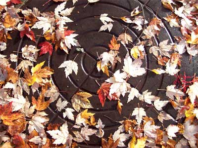
The first is a photo of a manhole cover that I came upon while out strolling, covered in leaves. Now, I love abstraction which is probably why I also like close-up, flat pattern shots. It has something to do with my way of seeing that I suppose has been heightened by all those years in art college. Ok first the regular color which I only slightly goosed up with the contrast setting.
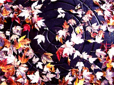
Next is my high contrast shot. I love it! It takes the color to another level, the manhole is now bluish and the leaves shocking. The pattern glows.
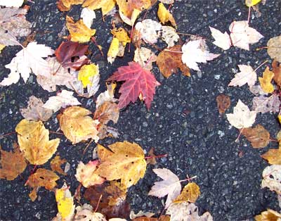
I love an all over pattern on a flat surface and what better than leaves on pavement? Ok first the usual ….
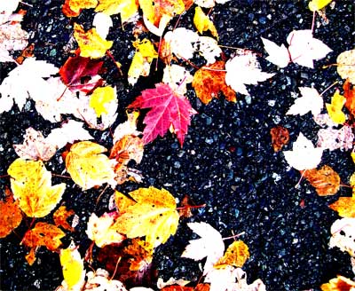
Now the souped up color. I love how it creates an even flatter surface, accenting the shape and color.
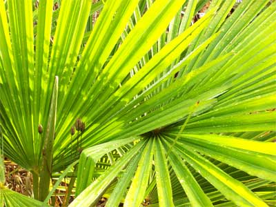
My windmill palm after the rain, close up, face right in the leaves. The “normal” version is for me wonderful, love those lines and patterns!
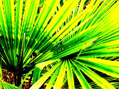
But then with the contrast boosted, oh my, it takes on a whole other feeling, the pattern is the focus!
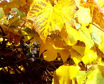
The grape arbour was a wealth of color, almost too much color in fact.
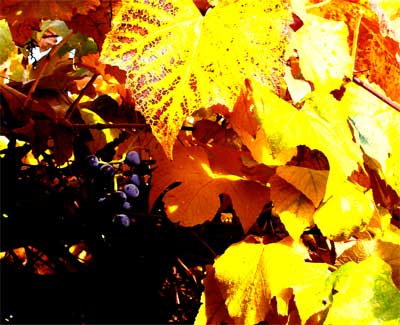
But then I played with it a bit. I wanted to create even more of a contrast and bring out the purple of the grapes and the beauty of the leaves.
Next is a mistake, I suppose. The shot naturally came out with this odd intense blue in the upper corner which I loved, of course.
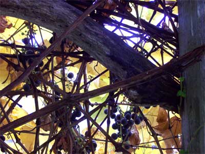
So also of course, I just had to go with that intense blue. And look what happened. I love the look of it.
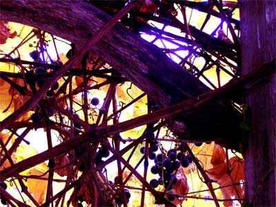
OK one more please…
This last one was also a mistake, the flash went off which of course flattened the whole photo. But, me, who loves flat pattern, it wasn’t so much of a mistake.
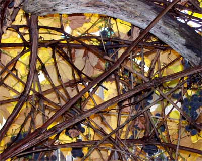
The next version is my attempt at taking that flatness even further. To me this now looks like light coming through glass, stained glass?
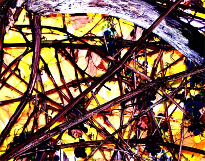
Ah, me, I just love Photoshop! Don’t you? Too much fun.

Yup, it’s pretty darned fun, so many possibilities, but you’ve gotta love the “mistakes” – I do!
its all good. taking pictures in its natural color might be better than changing its contrast and brightness. keep it up 🙂
Thanks for your comment and I must admit I do like the natural colors of fall. But the artist in me also likes the things that happen when you play with color and contrast. By highlighting certain things you create more than the original photo and what it represents and get into texture,pattern, color and line and create something new.